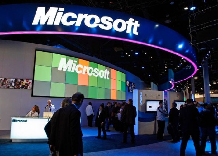
Remarkably similar to its old logo, Microsoft has declared its new logo is representational of its move towards new markets while maintaining that the company is still familiar and customers shouldn’t be wary to try out their new products and software lines.
Microsoft Corp. (MSFT) unveiled its first new logo in 25 years as it prepares to introduce Windows 8, an updated version of its flagship software that will power the company’s own Surface tablet and other touch-screen devices.
The logo uses the so-called Segoe font, which is used in Microsoft products and marketing materials, and four colored squares that are “intended to express the company’s diverse portfolio of products,” the Redmond, Washington-based company said on its blog. Read More