With the Olypics in full swing these past two weeks, it has been great seeing creative teams in full motion visualizing all the data surrounding these years London games.
Here are some of my favorites
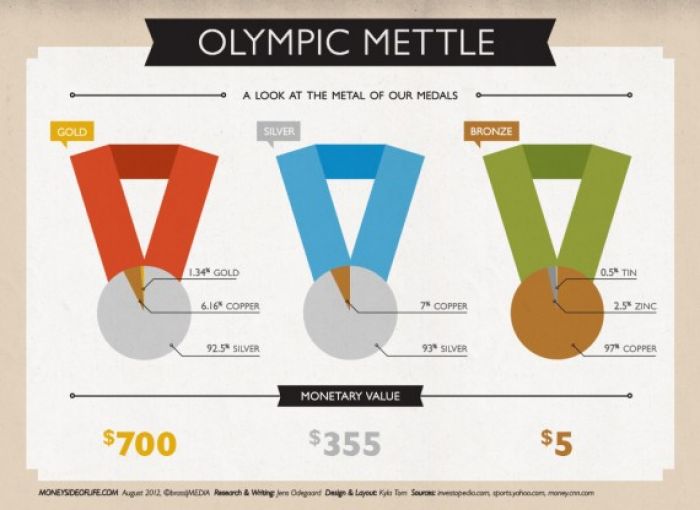
This is a great breakdown of what Olympic medals are actually made of and what their monetary value is. I thought it was hilarious how much less a bronze medal was worth in cash compared to a gold.
Source: Discover Infographics
2) 2012 Olympic Trivia and Stats
Everyone loves stats -- this is a great breakdown of almost every statistic related to the Olympics that I could link of. It is funny how out of date some of the info is already though, as Michael Phelps has once again proven himself as a premier athelete with several more golds.
Source: Vizual Archive
3) One Race, Every Medalist Ever
Leave it to the New York Times to absolutely go above and beyond in this data visualization that breaks down every race over the past 100 years of the 100 meter dash with an interesting look at how current atheletes compare with ones from the past.
Source: The New York Times