RO NEW YORK’s Creative Director and Founder Rony Zeidan is a luxury industry leader on building intelligent and sometimes disruptive creative campaigns and new brand identities. He founded RO NEW YORK to develop brands, and build concepts that communicate the essence of luxury.
Today, Zeidan’s knowledge and understanding of luxury business has broadened across multiple industries. He currently serves as an editorial contributor and advisor to Luxury Society and was a keynote speaker at the 2012 Fashion Digital New York conference. He also spoke at the Luxury Retail Summit: Holiday Focus 2014. It is no wonder then that one of his latest projects was to refresh the renowned Canadian luxury menswear brand Samuelsohn, a component of the ninety-year old brand, Hickey-Freeman.

When the brand was brought to Zeidan’s attention by Samuelsohn’s Creative Director, Arnold Brant Silverstone, Zeidan already knew the Canadian brand and their reputation. It is one that was built on custom detailing using luxurious fabrics such as cashmeres, combed mink, Vicuña, Kiviuk, Yangir and superfine wools. Zeidan then collaborated with Mr. Silverstone, helping to create a stronger brand awareness and consumer connection as they focused on updating key elements of the brand’s visual language, from redeveloping its logo to modernizing the look and feel of its advertising and collateral materials. What Silverstone wanted was to create a stronger bridge between brand and consumer, elevating the brand’s presentation while encouraging greater consumer engagement.
How did Zeidan and RO New York do this? We recently asked him about his creative rebranding process that went into refreshing this brand and creating the new brand voice from Silverstone’s product vision.

JustLuxe: What are some of the basic elements that underscore the Samuelsohn re-brand?
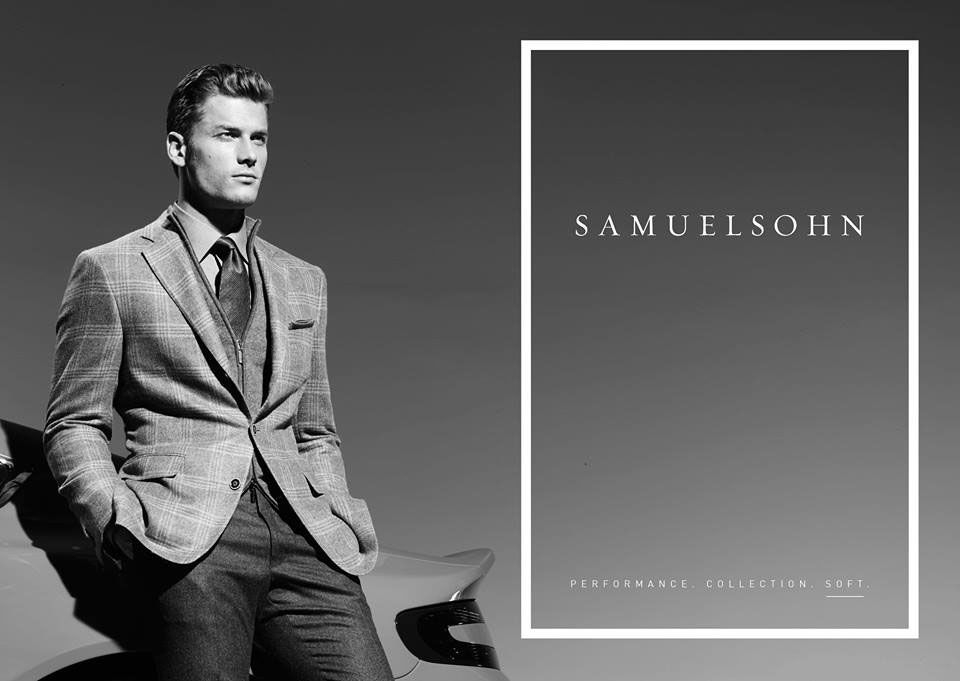
Rony Zeidan: Our new campaign underscores the evolution of the Samuelsohn brand, visually connecting the heritage and quality of its past with a distinctly modern, more luxurious future. From using the Aston Martin as the background in the advertisements to illustrate the high performance nature of the brand’s fabrications, to photographer Paola Kudaki’s graphic interpretation of Samuelsohn’s tailored clothing’s superior construction, the campaign was designed specifically to engage the man of impeccable standards, style and taste. We updated the logo, also, changing the type/font to give it an airier, luxurious feel. Plus, we shifted up the brand’s signature ‘stitch’ graphics to a bold white line for a refreshed aesthetic.
The new imagery will be used in print campaigns and direct mail, online and social media platforms. For the first time, the brand will advertise and run promotions in the digital space, recognizing how much their younger target uses online in their daily lives.

JL: Have you ever worked with a men’s clothing brand similar to Samuelsohn before? If not, what challenges did you have in conceptualizing how you would refresh the brand? If you have worked with a brand that was similar, were there lessons you learned before that you could apply to this brand campaign?
RZ: About four years ago I worked on the Joseph Abboud brand to join its namesake designer prior to its sale to Men’s Wearhouse. The focus then was on the Made-in-America messaging. This was during a very transitional time because most companies’ budgets had been trimmed tremendously due to the bad economic climates. Now, brands are investing in marketing initiatives and they are looking for a voice and the truth. Economic climates affect the mentality behind brand leaders and this time, with Samuelsohn, it was truly an assignment of searching for the truth, the voice, the strength and the optimal way of presenting the brand to its customers. Each brand has its own journey and essence, and very rarely is there an overlap or a learning approach to be adapted.
JL: When Arnold Brant Silverstone said that he wanted to create a stronger brand awareness and consumer connection thereby, what were your first thoughts as to your creative brand process?
RZ: The first thought I had was, “Great!” but I lacked familiarity with the brand. So the assignment became based on personal curiosity. It was perfect, because I was able to look at Samuelsohn with new eyes and capture both the good and the challenging, and this opportunity presented itself within a brief period of time, not muddled by history or previous brand attributes. I immediately requested to connect with a variety of store owners/buyers because I wanted to know what their thoughts were on the brand, both positive and negative. Within the second interview it was evident that Samuelsohn was perceived as a manufacturer instead of a brand. Upon this discovery, we first put to action a plan of defining the brand in words, then after that, visually, and soon the puzzle pieces started flooding into form.

JL: Samuelsohn has as its heritage DNA the Hickey Freeman Company. Do you as a brand and image person find it easier or difficult to have a product with a heritage, or have a product that has no actual history, and whose brand you can create from scratch?
RZ: I love branding. Period. I enjoy working with a heritage that provides you with a platform to start from, and I also thoroughly enjoy building that platform from scratch for the brands that don’t have one. When there is no pre-existing platform, you rely on the individual behind the brand and you try to extract from them the most important and core values, and you’re able to bring that to life in different ways. When you work with heritage brands, sometimes it’s an evolution, and other times a revolution if the heritage does not have the ability of connecting with consumers for any reason. The experience is similar; the difference is how much you create from thin air.
JL: When you update current Samuelsohn themes, what is the process by which you do this? What is the process of refreshing a brand like Samuelsohn?
RZ: The first step was identifying the man behind Samuelsohn—his character, his demeanor, his interests etc.—then developing the aesthetics that would appeal to the character, while also thinking about the consumer’s reaction based on their own current brand perspectives. This process requires instinct paired with a strategic thought process. Simultaneously, you have to think about the mark, the logo, the packaging, the sales materials presentations and the visual positioning on a scale of modern and classic. When it comes to men’s suiting brands you have to understand how men think and react, (both actively and passively) to what they see. In the case of Samuelsohn, the target audience is broad, ranging from 30 to 60, younger wanting a more modern aesthetic, and as you get older, veering towards the classic. I believe we achieved the right balance of both with the end result.

JL: With the refurbishment of this brand, did your process involve a brand evolution, given the fact that the clothing brand had been in existence for so long? In either case, please explain the process.
RZ: The first insight from the research was the retailer’s perception of the brand being a manufacturer with amazing quality product, at an opening price point for their clients. We took that insight and then worked on identifying the voice, the logo mark, and the typographic language throughout all materials: the graphic language. From there we took their existing asset of the stitched frame and presented it in a modern bold white rectangle overlaid on an image. We then developed different visual directions the brand could go into and assessed whether a tagline was necessary or whether the image itself would convey it without a written message. Color was also of concern with a strong equity in packaging, with the ivory and the red, we categorized the use of color based on their product labels, and then modernized the choice of paper usage in packaging and hang tags. It was truly a transformation from the ground up. There wasn’t much we needed to draw from the heritage as the focus was on providing Samuelsohn with more of a designer brand code rather than a manufacturer look.

JL: We know you spoke about the UHNW consumer at one of the Luxury Society gatherings in London this year. How did your understanding of their purchasing behaviors and expectations help you in the refreshing of this brand?
RZ: The UHNW consumer in North America has shifted their shopping approach from the ostentatious to the demure. They purchase wisely and they purchase quality. They know when a suit is worth the price tag. They are brand loyalists to a certain extent, pending the quality of the service they get; they expect amazing service. Samuelsohn is that very special brand that offers a Brioni suit quality, with amazing Italian fabrics at a fraction of the cost of Brioni. The majority of their business is Made-to-Measure, which naturally implies service. So there is a large opportunity of capturing the UHNW individual who would buy several suits in one fitting. Thus the communication of the brand was identified as a luxury communication. The voice is refined, the visuals in black and white are bold, yet casual, and evoke that sense of luxury where we are not focusing on a fashion statement highlighting a certain jacket, but rather an overall mood and sense of luxe.
JL: If there is anything else you would like to add, please do so here. It is always of interest to learn how you refine a brand through redefining its root system and refocusing on the needs of the buying demographic.
RZ: With a product so beautifully crafted and made in North America, the preliminary conversation was around whether we should highlight the Canadian made aspect of the brand. The result was unnecessary, because once a consumer touches the fabric and tries on the suit, they are sold on the brand. So the branding assignment was focused on the presentation of the product and the way we evoked it in advertising. We clearly identified the categories of the brand: Collection, Soft and Performance with three, 15-second videos showcasing the feeling you would get from each type of suit when you wear it. The result was going from a lifestyle image to a luxury image.